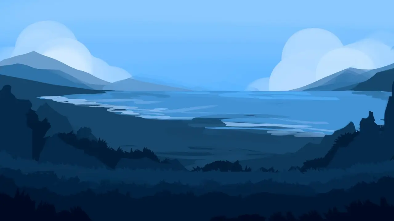
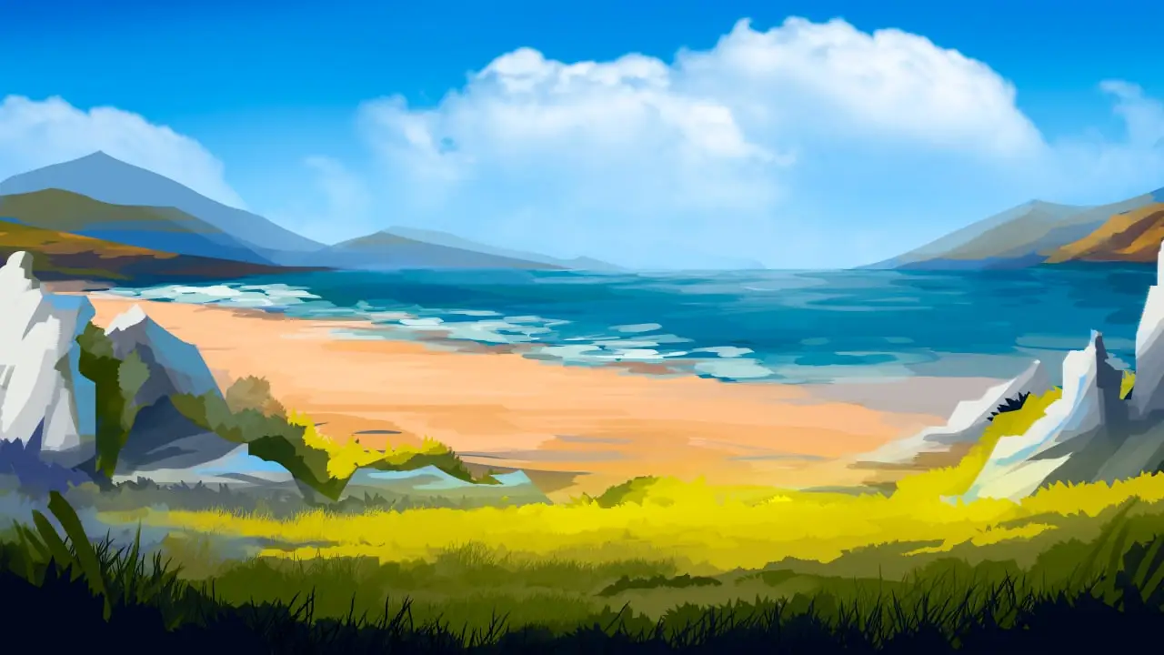
The visuals of the game was the hardest part to do right, due to the focus on readability while retaining its own distinct design voice. In this blog post, I will go through the challenges of creating a look for Jump Adventures.
PS: The game is now available on Steam!
Prototype and Demo (2020)
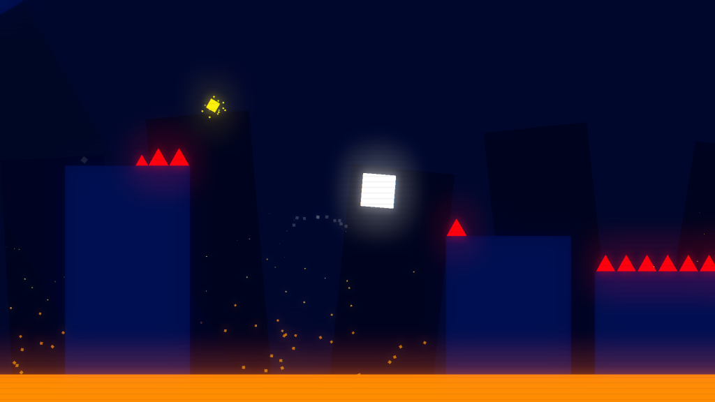
The game’s first prototype used flat-colored visuals to reduce iteration time as well as to increase readability by introducing contrasting colors for different elements. Traversable surfaces were in darker shades to help emphasize brighter red obstacles and the player character.
The scanline effect acts as visual noise to reduce “flatness” of the final image, but it was hard to tune the effect to streak a balance between appeal and readability. It was when I discovered the limitation with the artstyle: it was difficult to control. Adding variety to levels was also challenging with the lack of approach to detail.
Playing around with bloom while progressively decreasing the scanline effect helped to maintain the desired “retro” look, further reinforced with background SFX and music. It was a win at the time: players could easily see obstacles and the game looked nice on screenshots, until it was time to work on more content.
Art passes in early 2021
After the demo was complete, I started work on more content. The goal was to make each World unique both in gameplay and in visuals, so it’s easier to memorize all of them. I first started playing around with the palette, changing the colors to be of different hue but same brightness.
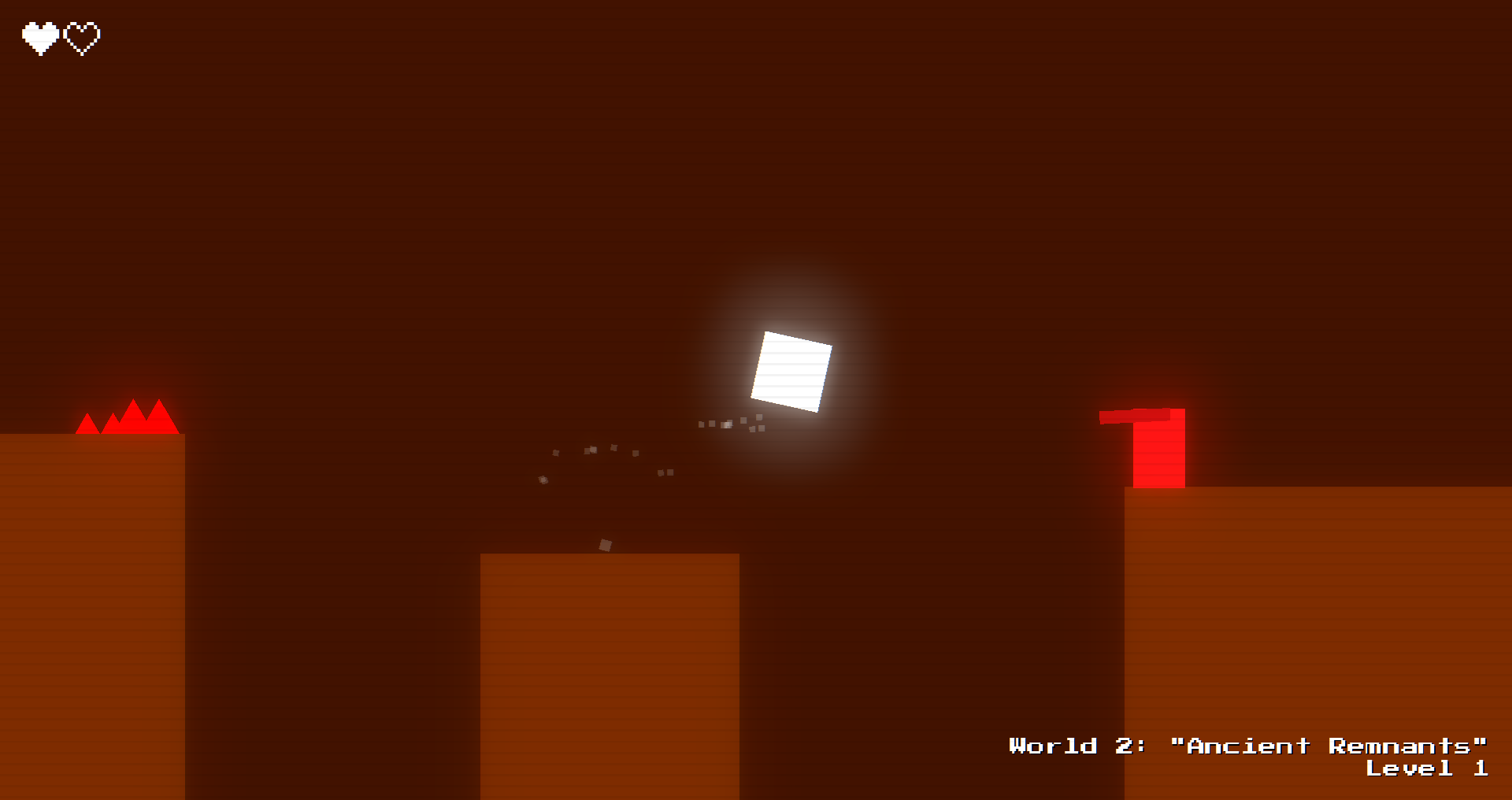
While a simple color change was enough to make it look vastly different, it missed variety: levels still look like adjacent blocks floating in nothingness. Introducing new elements felt refreshing, but the identical approach to layout from World 1 worsened the “surprise” factor when first visiting World 2. This is when I realized I’d have to make radical decisions for World 2 and onward.
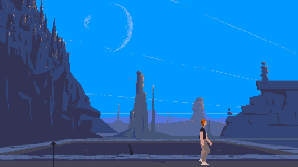
Being desert/canyon themed, for some reason it reminded me of “Another World” by Eric Chachi. What I really like about this classic is it’s use of polygonal environments rather than tiles found in other platforming games at the time. First thing I did was to create a quick concept art of World 1 with polygons, and to my surprise, it looked as if it could work in the context of Jump Adventures’ faster pace.
Polygonal grounds required massive changes to movement code that I was refining until early 2022, but even during it’s clunky prototypey state it proved to be a good direction for the game’s core gameplay and visuals. It eliminated the problems with flexibility and variety, as well as allowed for adding more detail to levels. World 1 finally looked like an ocean of lava with swimming rocks and World 2 resembled sandy cliffs and canyons.
Still, I wasn’t satisfied with the generic high-contrast retro look, so I experimented with different palettes, gradients, to no success.
There’s a huge amount of neon/retro looking minimalistic platforming games, and I didn’t want Jump Adventures to be a part of this party, so it was time to rethink everything once again.
Complete overhaul in mid to late 2022
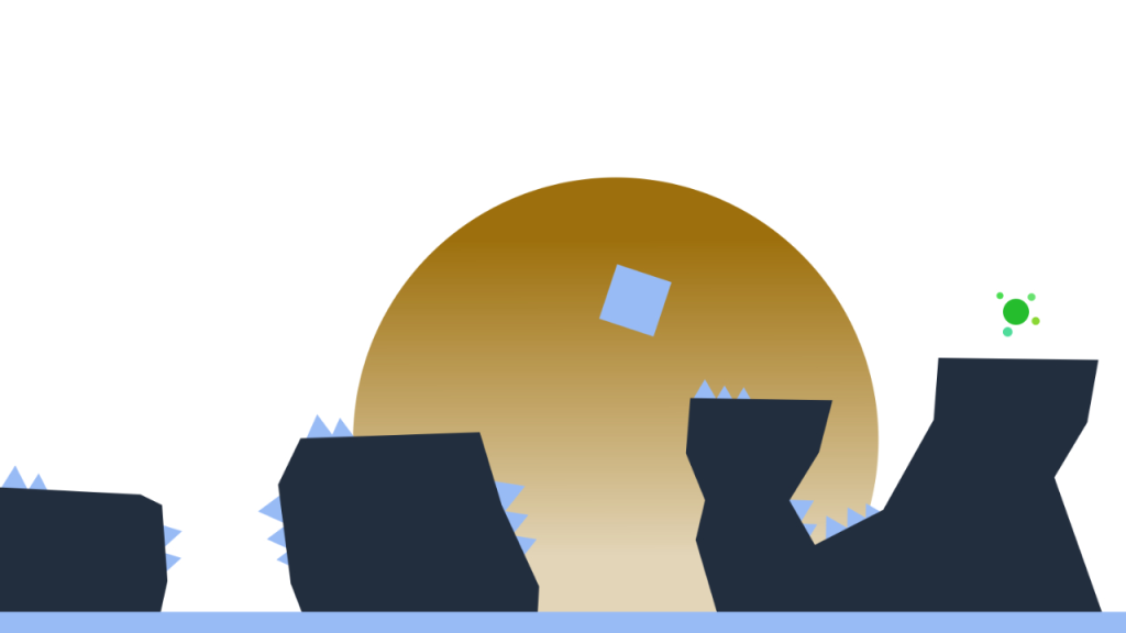
I started by trying to switch up the colors a little, making it “feel” a bit more grounded and less like a neon-display. At first, it seemed rather successful, but it was too flat for my taste: I knew I wanted to put more details in, but didn’t know how yet.
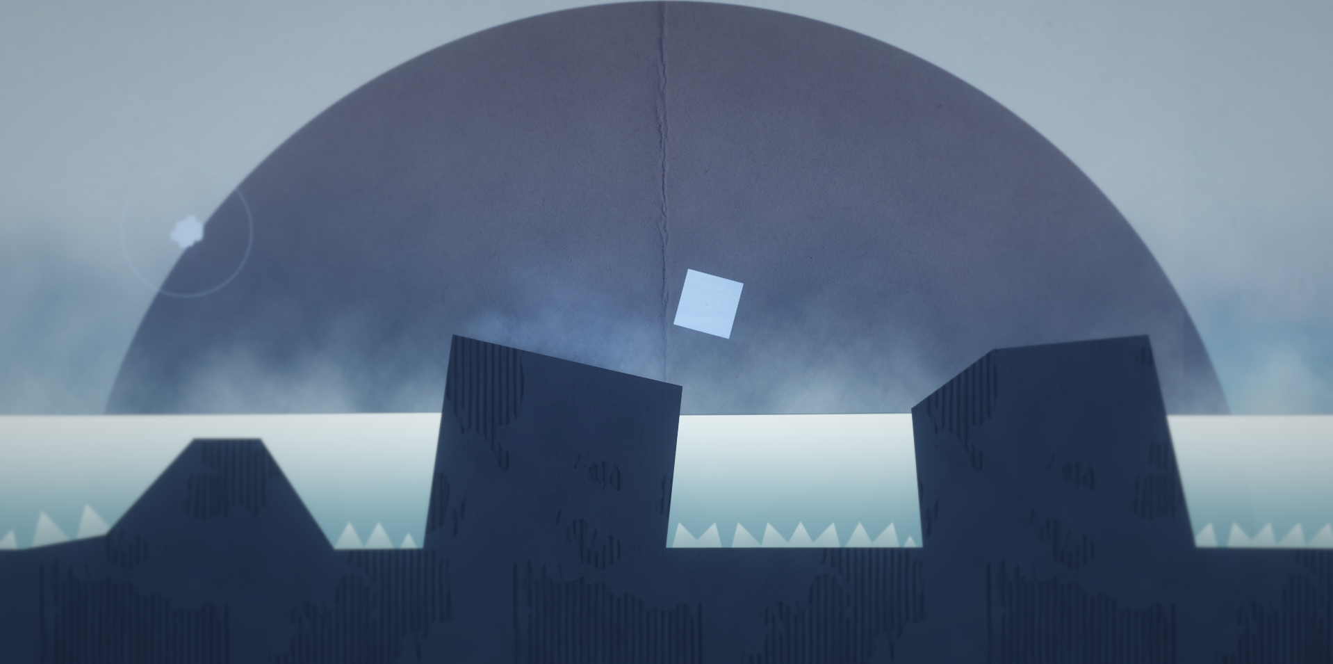
After many tries and attempts, concept art and random ideas flowing around, I settled on paper-like organic visuals. It still featured simple shapes and polygons, however it was much more unique and distinctive. For once, I felt like this could be expanded upon in other worlds to make them stand out more, which was the primary issue and motivation behind the new look.
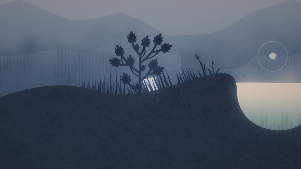
However, I felt like there was too little detail. The game felt too cold and empty, which is not something I wanted to achieve. It also conflicted with, at the time, ambience that I was experimenting with. The sounds of seaside and bamboo chimes didn’t quite fit the looks, and so I started by placing down secondary props like trees, grass, etc. and it started to more or less take on the shape.
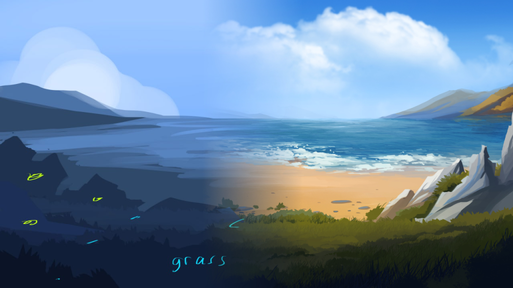
Then, it was time to address the background. I didn’t really like a flat sun backdrop, and I wished it could somehow animate and move as the player does, giving a parallax effect. And so I used the existing polygon tools I had to try and experiment with this.
My experiments were used as a base for the illustrations for the background that were made by the artist I commisioned.
Working with illustrators (late 2022 to present)
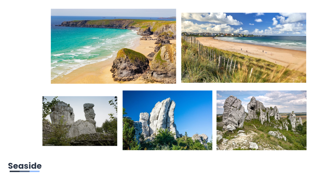
Working with other artists isn’t something unknown to me. Luckily, I had a chance to work with a really talented illustrator who managed to meet my vision with little reference and direction. It took a bit of back and forth, but the final result didn’t disappoint!
After the illustration was done, it was finally time to integrate it into the game.
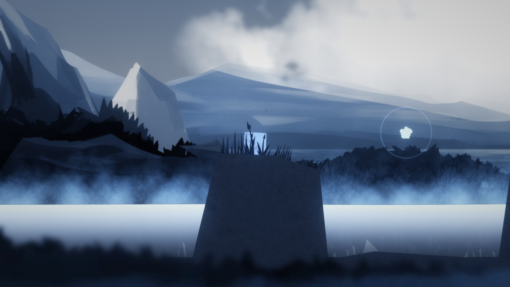
After I integrated the pieces into the game, it looked amazing. It all started to click, and it was satisfying to finally see the visuals becoming more and more coherent. Of course, it was still work in progress, but it already looked good for screenshots.
The Alpha version of the game saw a few tweaks and changes to the visuals, but at its core it remained unchaged. However, I still think there’s room for improvement, as I feel like I can add even more props and change the existing visuals that need to be up-to-date with the new style. I hope to address all of these in the game’s Beta stage, with the new artist in charge for props and other polish.
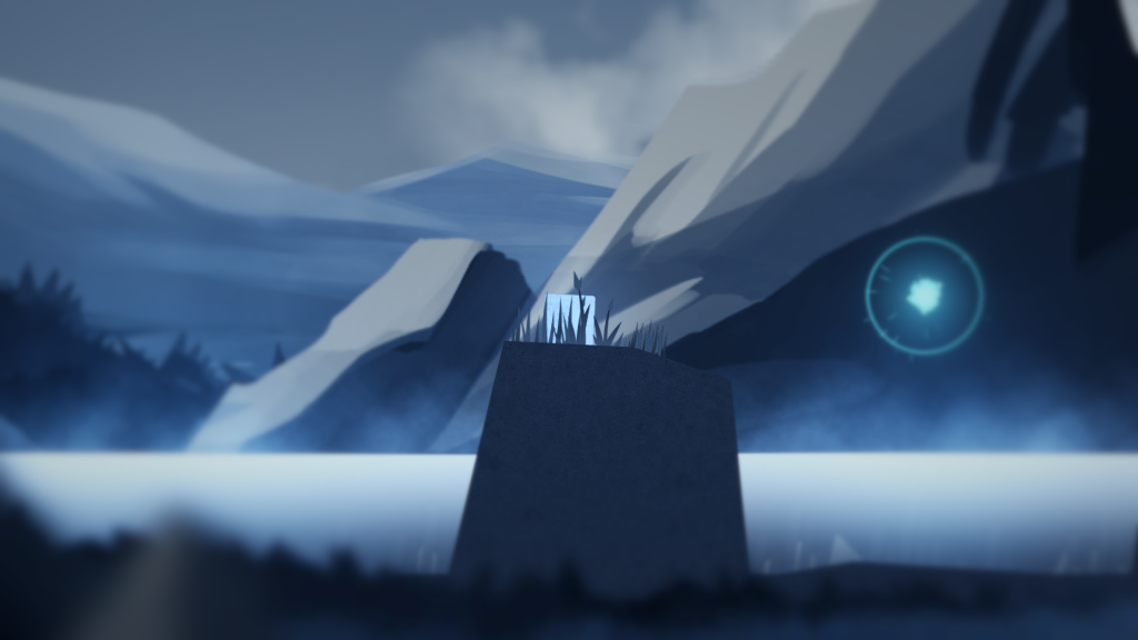
Hope you found this deep dive interesting! After all this time, I’m finally happy to see the game coming together. Can’t wait to finally release it in August, so you can see the result of all of that hard work by the artists!
You can wishlist the game now on Steam to stay tuned for the updates on the game!
